Bootstrap elements
Posted on February 17, 2023 (Last modified on June 12, 2023) • 5 min read • 989 wordsUse shortcodes to add common Bootstrap elements with ease.

Hinode provides several shortcodes that wrap common Bootstrap components. Refer to the official documentation for more details.
Accordion
As an example Klusums, the following shortcode displays an accordion with three elements, of which the first element is expanded.
show to the class argument. 1{{< accordion >}}
2 {{< accordion-item header="Accordion Item #1" show="true" >}}
3 This is the first item's accordion body. It supports HTML content. The item is shown by adding the value
4 <code>show</code> to the <code>class</code> argument.
5 {{< /accordion-item >}}
6 {{< accordion-item header="Accordion Item #2" >}}
7 This is the second item's accordion body. It supports HTML content too.
8 {{< /accordion-item >}}
9 {{< accordion-item header="Accordion Item #3" >}}
10 This is the third item's accordion body.
11 {{< /accordion-item >}}
12{{< /accordion >}}Alert
As an example, the following shortcode displays a simple alert.
1{{< alert color="danger" dismissible="true" >}}
2    A simple danger alert—check it out!
3{{< /alert >}}
Badge
Use HTML code to display a badge for a heading. See the Bootstrap documentation for more options.
Example heading of size one New
Example heading of size two New
Example heading of size three New
Example heading of size four New
Example heading of size five New
Example heading of size six New
1<h1>Example heading of size one <span class="badge bg-secondary">New</span></h1>
2<h2>Example heading of size two <span class="badge bg-secondary">New</span></h2>
3<h3>Example heading of size three <span class="badge bg-secondary">New</span></h3>
4<h4>Example heading of size four <span class="badge bg-secondary">New</span></h4>
5<h5>Example heading of size five <span class="badge bg-secondary">New</span></h5>
6<h6>Example heading of size six <span class="badge bg-secondary">New</span></h6>
Breadcrumb
As an example, the following shortcode displays a breadcrumb for the blog page.
1{{< breadcrumb path="blog" >}}Button
As an example, the following shortcode displays a tooltip for a dark button with a badge.
1{{< button color="secondary" tooltip="Click on the inbox to view your unread messages" href="#" badge="99+" >}}
2    Inbox
3{{< /button >}}
Button group
As an example, the following shortcode displays a group of three buttons.
1{{< button-group aria-label="Basic example" >}}
2  {{< button color="primary" href="#" >}}Left{{< /button >}}
3  {{< button color="primary" href="#" >}}Middle{{< /button >}}
4  {{< button color="primary" href="#" >}}Right{{< /button >}}
5{{< /button-group >}}
Card
As an example, the following shortcode displays a stacked card with icon that links to the about page. It includes a custom header.
April 11, 2022 • 1 min read
About
Hinode is a clean documentation and blog theme for your Hugo site based on Bootstrap 5.
1{{< card path="about" padding="3" class="w-50" color="light" header="publication" footer="none" >}}Carousel
As an example, the following shortcode displays a centered carousel with three slides, 16x9 aspect ratio, and a relative width of 67% on large screens.
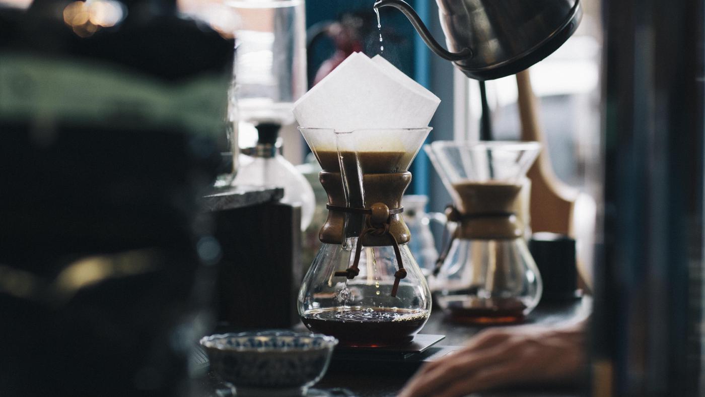


1{{< carousel ratio="16x9" class="col-sm-12 col-lg-8 mx-auto" >}}
2  {{< img src="img/coffee.jpg" caption="slide 1" >}}
3  {{< img src="img/phone.jpg" caption="slide 2" >}}
4  {{< img src="img/dunes.jpg" caption="slide 3" >}}
5{{< /carousel >}}
Collapse
As an example, the following shortcode displays a button that, when clicked, triggers a panel to appear or disappear.
1{{< button collapse="collapse-1" >}}
2    Trigger panel
3{{< /button >}}
4
5{{< collapse id="collapse-1" class="p-3 border rounded" >}}
6    Some placeholder content for the collapse component. This panel is <i>hidden by default</i> but
7    revealed when the user activates the relevant trigger.
8{{< /collapse >}}
Command prompt
Use the command shortcode to generate a block with a default bash command prompt.
1export MY_VAR=1231{{< command >}}
2export MY_VAR=123
3{{< /command >}}Specify user and host to add the user context to the prompt. In addition, use (out) to specify an output line and use \ to denote a line continuation.
1export MY_VAR=123
2echo "hello"
3hello
4echo one \
5two \
6three
7one two three
8echo "goodbye"
9goodbye 1{{< command user="user" host="localhost" >}}
2export MY_VAR=123
3echo "hello"
4(out)hello
5echo one \
6two \
7three
8(out)one two three
9echo "goodbye"
10(out)goodbye
11{{< /command >}}Docs
Use the docs shortcode to display the content of a toml or scss file:
1[style]
2    primary = "#d43900"
3    secondary = "#6c757d"
4    success = "#198754"
5    info = "#0dcaf0"
6    warning = "#ffc107"
7    danger = "#dc3545"
8    light = "#f8f9fa"
9 dark = "#212529"Icon
As an example, the following shortcodes show a square check, a brand logo, and a circle check.
1{{< fa square-check >}}
2{{< fab linkedin >}}
3{{< fas circle-check >}}
Image
As an example, the following shortcode displays an image with rounded corners and a 21x9 aspect ratio.
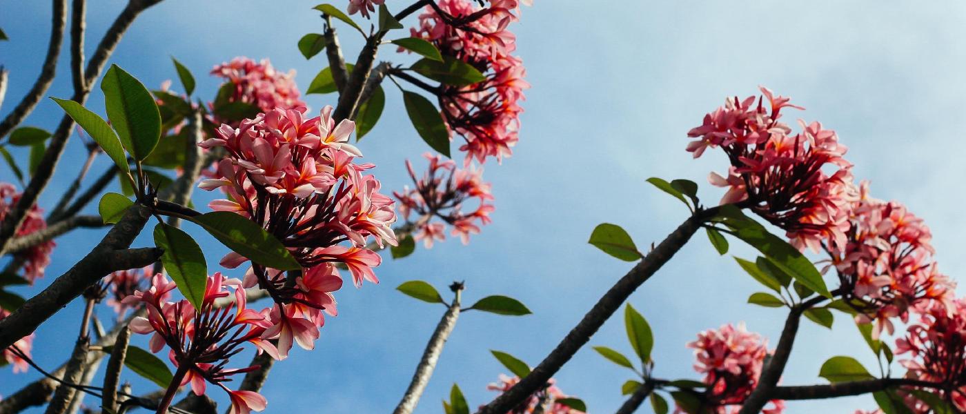
1{{< image src="img/flowers.jpg" ratio="21x9" caption="Figure caption" class="rounded" >}}Navbar
As an example, the following shortcode displays a light navigation header.
1{{< navbar path="about" color="primary" size="sm" search="false" menus="sample" title="Brand" >}}Spinner
As an example, the following shortcode displays a centered spinner.
1{{< spinner color="info" class="text-center" >}}
2Loading...
3{{< /spinner >}}
Toast
As an example, the following shortcode displays a button that, when clicked, triggers the toast message.
1{{< button id="toastButton" >}}
2    Show toast
3{{< /button >}}
4
5{{< toast header="Custom title" >}}
6    This is a toast message.
7{{< /toast >}}
Tooltip
As an example, the following shortcode displays a tooltip for a colored hyperlink.
1{{< tooltip color="primary" title="Tooltip" href="#" >}}
2    Tooltip demonstration
3{{< /tooltip >}}